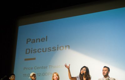
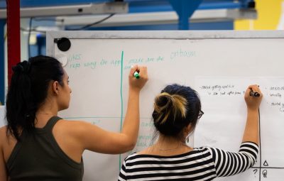
Kate Gallagher with the San Diego Economic Development Corporation (EDC) needed a website redesign for their Link2 San Diego program that connects students to critical industries in the region’s economy. A few months ago, Naval Air Force Cmdr. Jeremy Vellon participated in a design-thinking workshop I led with Joshua Welle, a technology entrepreneur, public policy expert and Commander in the Navy Reserves, and Micah Murphy, a federal executive fellow at the Center for Strategic and International Studies (CSIS) at the U.S. Naval Institute’s “West 2017” conference. Instead of looking to hire high-powered UX and web design companies, she reached out to students involved with UC San Diego’s Design Lab. Here’s why.
The San Diego Regional EDC launched the Link2 San Diego program in 2015 to help repair the disconnect between San Diego college students and San Diego companies in sectors such as manufacturing, life sciences, defense and information technology. Recent studies indicate that San Diego students are not informed of opportunities in the San Diego region and feel pressure to move to the Bay Area or other urban areas around country.
Under Link2 San Diego, the San Diego Regional EDC wants to change this perspective by bringing students directly to industry leaders through a series of events where students can meet with professionals, gain connections and build local career paths.
“Coming into this project I was kind of shocked that we didn’t have any student involvement in this part of the Link2 San Diego program,” said Gallagher. “It was kind of a no-brainer to have students design something that students will use.”
Before the website redesign, Gallagher was spreading the word about Link2 San Diego events through flyers and Eventbrite pages. “I had a vision for the website. I wanted it to be a more of a resource for students and less of a halfway point,” she explains.
Gallagher recruited help from the Design Lab for the Link2 San Diego website after she was approached by Dev Bootcamp, a company that teaches coding and web development skills. Looking for more projects for their graduate students, Dev Bootcamp asked the San Diego Regional EDC if there were any opportunities for their graduate students to build websites. Right then Gallagher saw a huge opportunity. She realized that with Dev Bootcamp students working on the back-end coding and UCSD Design Lab students working on the front-end design, this website could be the best opportunity to showcase student talent in San Diego.
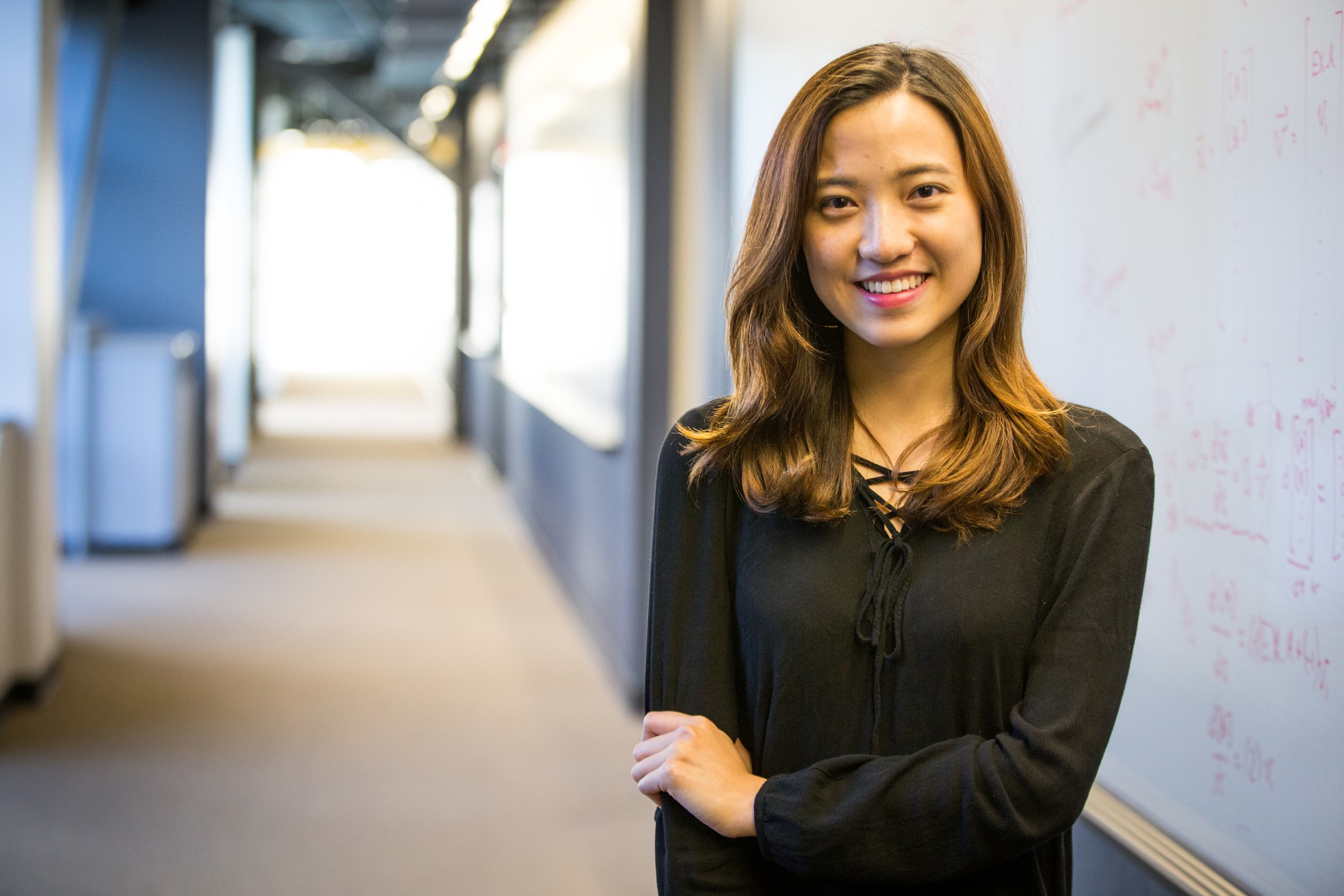
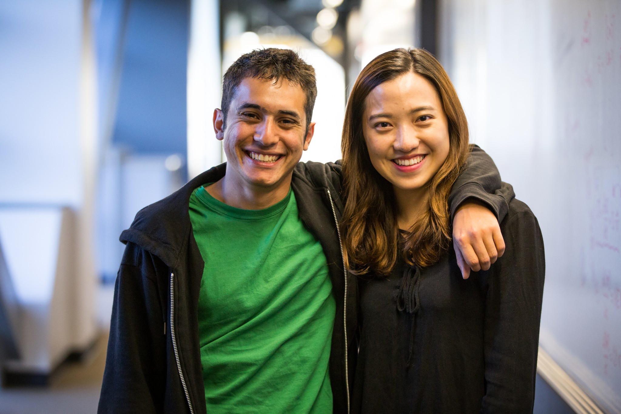
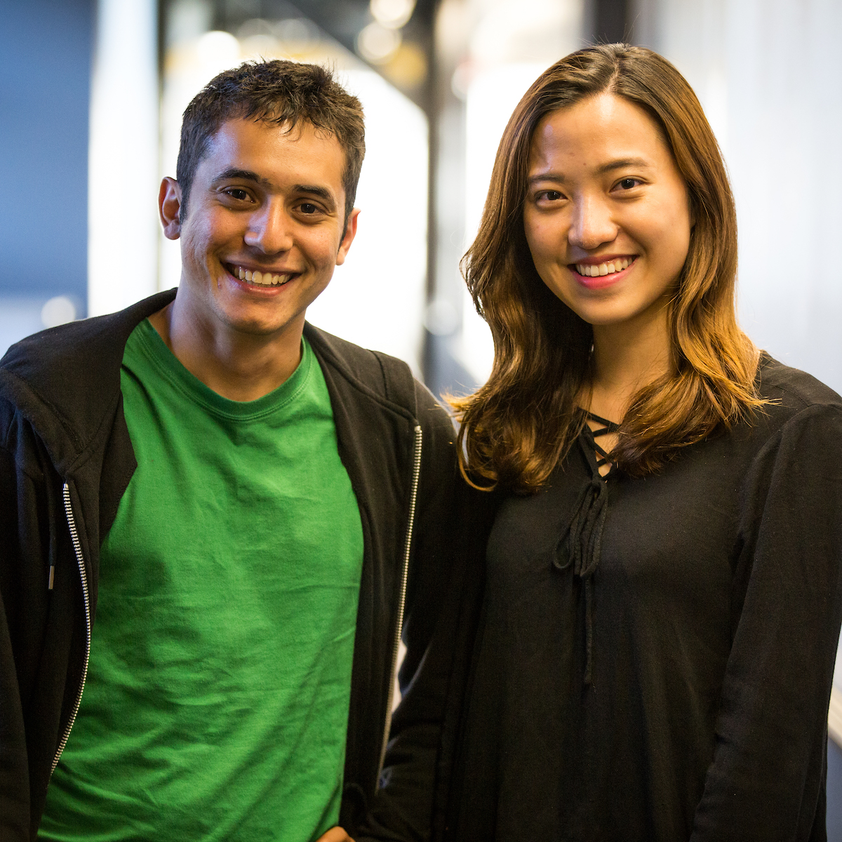
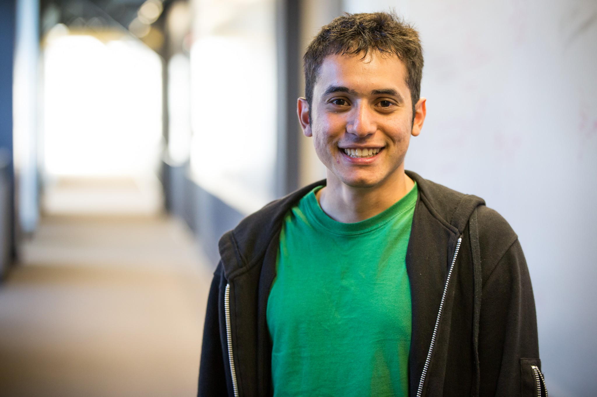
Enter Enrique Zavala and Fiona Chang, a third-year and fourth-year student, respectively, at the Design Lab. Both approach cognitive science from different paths, Zavala from business and Chang from psychology, but both were equally excited to apply their design-thinking concepts to real-world problems.
Like every project, the Link2 San Diego website had its own set of challenges. Early on, Zavala and Chang realized that this project was too much for a two-person team to handle in such a short amount of time. So they recruited more students and developed a two-team system.
“We kind of split into halves when we were doing the prototype,” Chang says. “Enrique and Alex [were] making the first prototype, the wireframe, actually, and me and Melissa were working on style tiles, the design elements. And then we combined…we trusted in the process.”
“I think one reason why it took longer than expected is that most clients don’t really know the UX process,” explains Chang. “They didn’t expect so many steps and usually are looking for people who just design, make it pretty [or] something like that. But many people didn’t know there’s actually user research, competitive analysis, card sorting and making personas.”
“Dealing with the client taste [is] something that we definitely learned, managing client expectations, managing how we should defend our designs and whether we should go with her taste or not,” says Zavala.The Link2 redesign was also a learning experience for Gallagher.
“I didn’t know what to expect. I had never seen their work before, I had never designed a website, so I was just glad to have students on board and so willing to put their time and effort into the project,” she says. “During our initial conversation, both the designers and I had big ideas for what this website could become, but we decided to focus on building something basic first. I was glad we didn’t bite off more than we could chew. We are all busy and it would have been too much of a lift for either me or them to commit to something too complicated.”
Gallagher’s exposure to the UX design process also introduced her to new types of data and different ways of thinking.
“Before we even started on the design, Fiona and Enrique were very adamant about conducting user research, which the EDC had never done before, and the results were something I found very valuable,” Gallagher explains.
Ultimately, Gallagher has no regrets about the project. “I’m really happy we decided to go this route,” she says. “I know Fiona and Enrique feel like they got real-world experience, but I want to be clear that it was a mutually beneficial relationship. I have a product I’m happy with.”
